Redesigning the Teacher Dashboard for Scale, Clarity, & Daily Usability
The Teacher Dashboard is a core product used by instructors at BrightCHAMPS to manage classes, track students, and perform post-class activities.
Overview & Context
The Teacher Dashboard is a core tool used daily by instructors to manage classes, students, evaluations, and post-class activities. Over time, the dashboard became functionally rich but increasingly difficult to use as new features were layered onto an existing structure. Navigation felt heavy, workflows were fragmented, and the overall experience no longer matched how teachers worked day to day.
The goal of this project was to redesign the entire teacher dashboard to improve clarity, usability, and scalability—while preserving the existing flow so teachers could transition without disruption.
Core Problem
The dashboard supported all required tasks but placed a high cognitive load on teachers. Related actions were spread across multiple sections, context was easy to lose when switching between students, and the interface lacked a clear hierarchy. The challenge was to simplify daily workflows and modernize the experience without breaking familiar patterns that teachers already relied on.
Research & Discovery
To ground the redesign in real usage, we conducted qualitative research with active teachers and teacher team leads who regularly interacted with the dashboard.
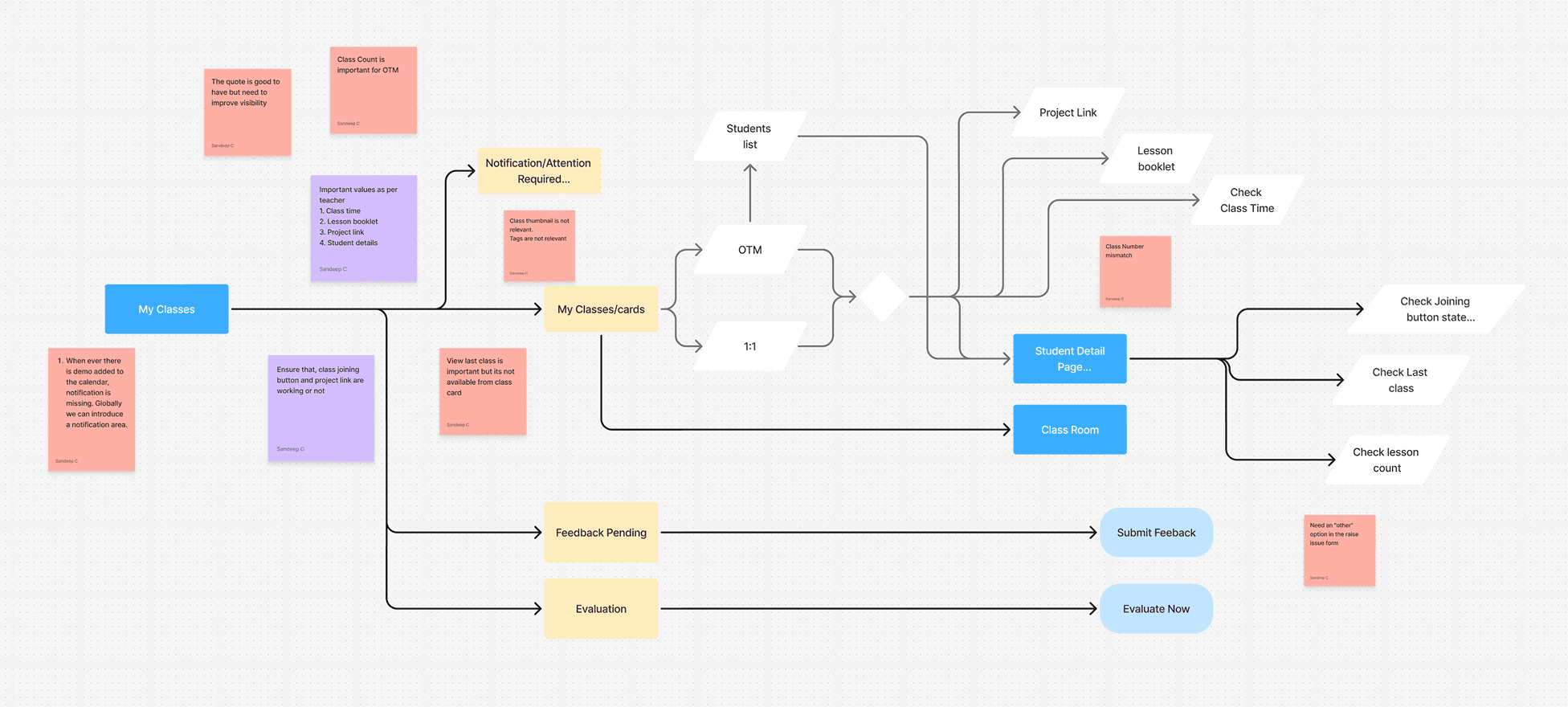
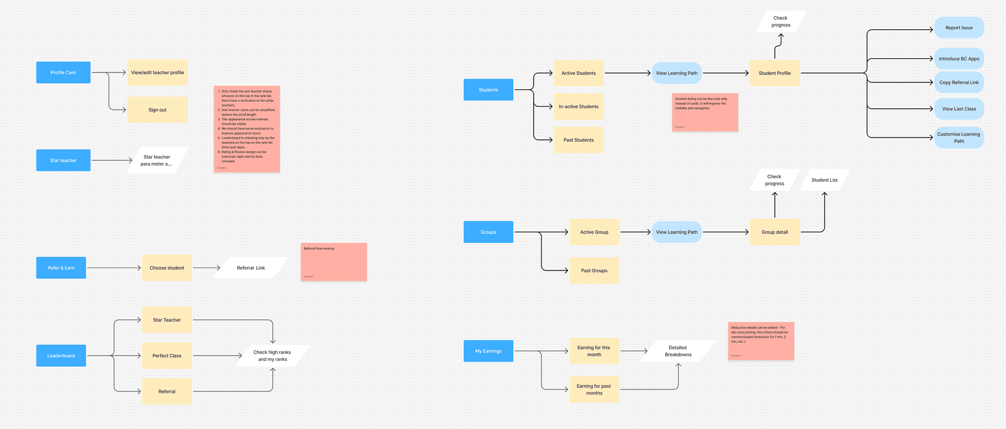
UX & Structural Issues
Poor visual hierarchy caused important information to be missed
Critical links (booklet, project, assignments) lacked visibility
Excessive scrolling and oversized widgets increased cognitive load
Discoverability issues made teachers feel “stuck” frequently
Inconsistent data across sections reduced trust
Workflow Pain Points
Teachers checked multiple places before every class
Class preparation required unnecessary steps
Search and referral flows were inefficient
Calendar and class lists were slow to navigate
Emotional Friction
Performance metrics felt punitive rather than supportive
Teachers felt anxious about deductions without clarity
Visual overload led to fatigue and burnout
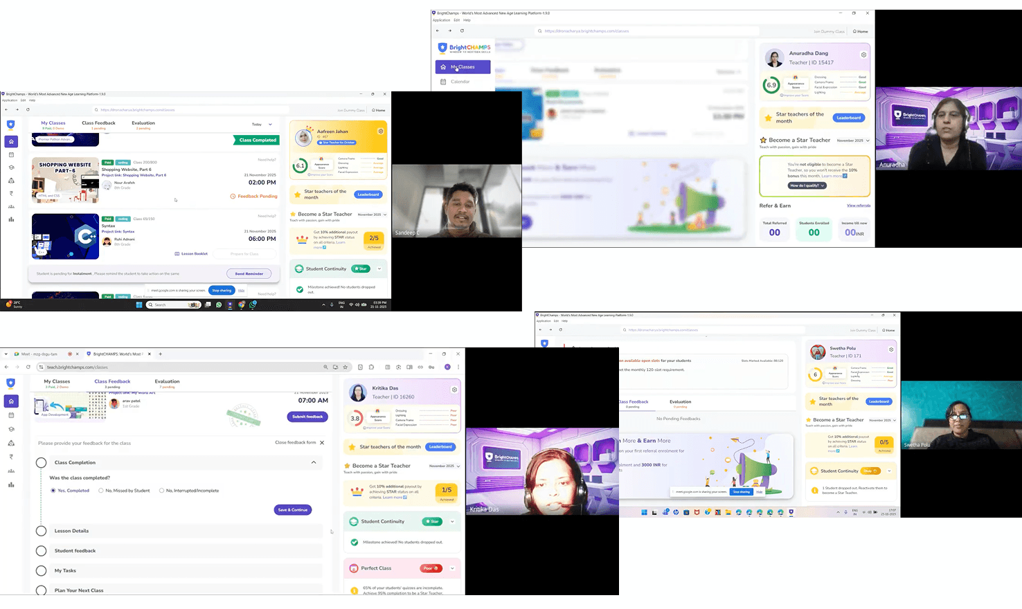
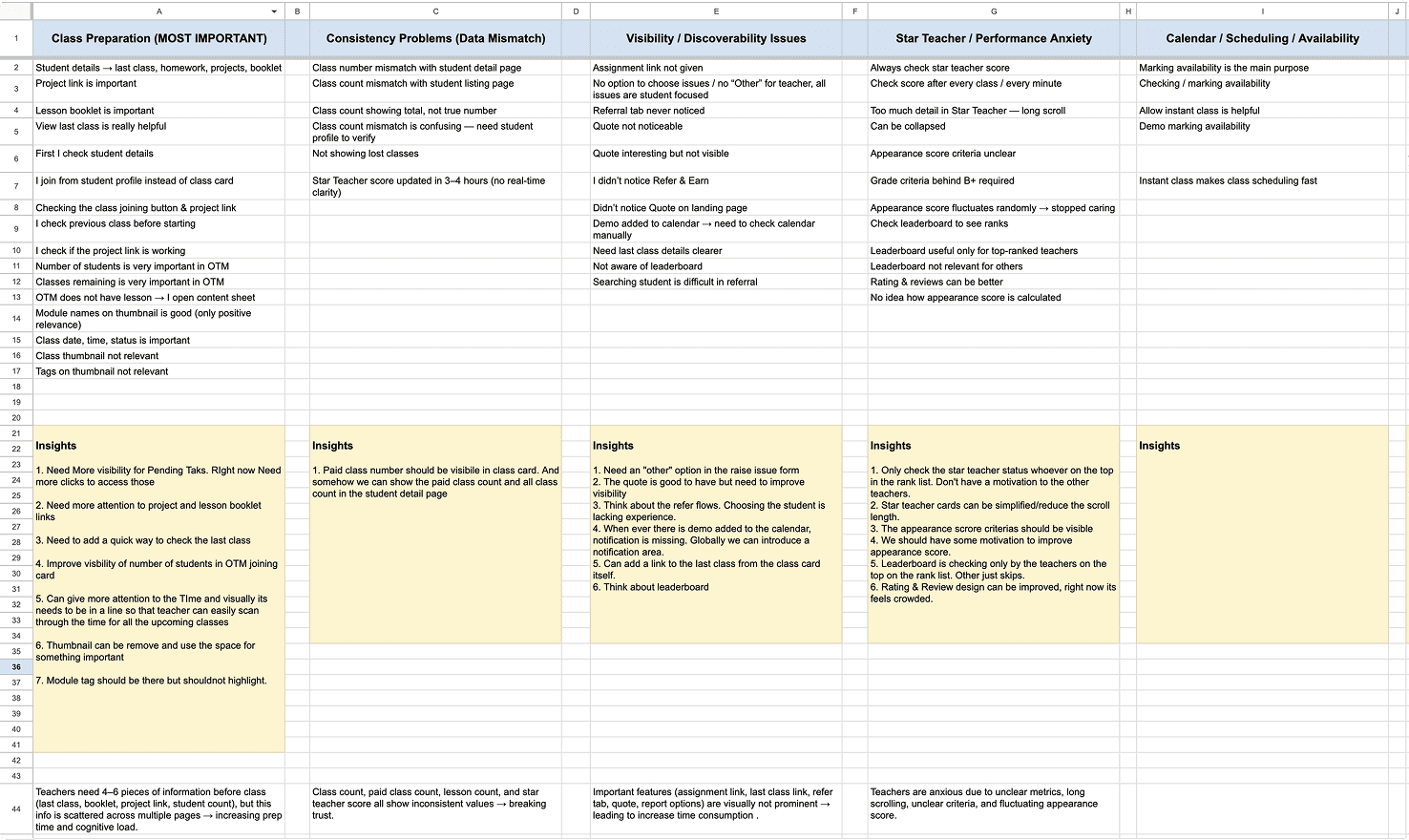
Teachers shared how they prepared before classes, what slowed them down, and where the dashboard failed to support their workflow—especially during high-pressure moments like back-to-back sessions.
Design Direction
Based on research, the redesign focused on:
Restoring visual hierarchy around critical teaching information
Ensuring consistency across grades, counts, and earnings
Reducing cognitive load through progressive disclosure
Designing for emotional clarity and trust, not just efficiency
Making preparation-related content immediately accessible
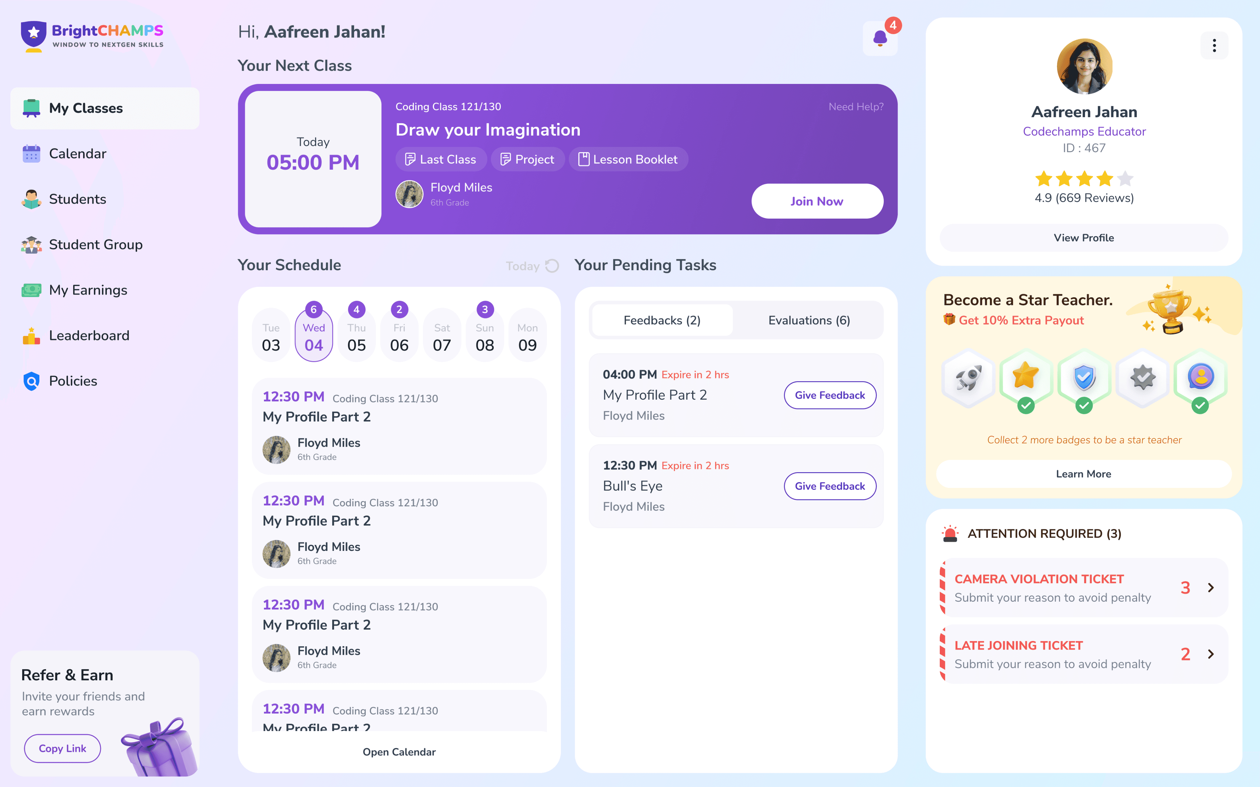
Final Visual Designs
Here is the final visual outcomes of the teacher dashboard redesign. The screens reflect a balance between introducing new capabilities and refining existing patterns, with a focus on clarity, reduced cognitive load, and smoother day-to-day workflows for teachers.
Notification Center
A dedicated notification center was introduced to centralize updates, alerts, and important system messages.
Why
Teachers were missing critical updates because notifications were scattered or visually de-emphasized. Centralizing them improved visibility and reduced anxiety around “missing something important.”
Mini Calendar
A compact calendar view was added to give teachers quick visibility into upcoming classes without navigating away.
Why
Teachers frequently checked schedules multiple times a day. The mini calendar reduces navigation friction and supports quick mental planning.
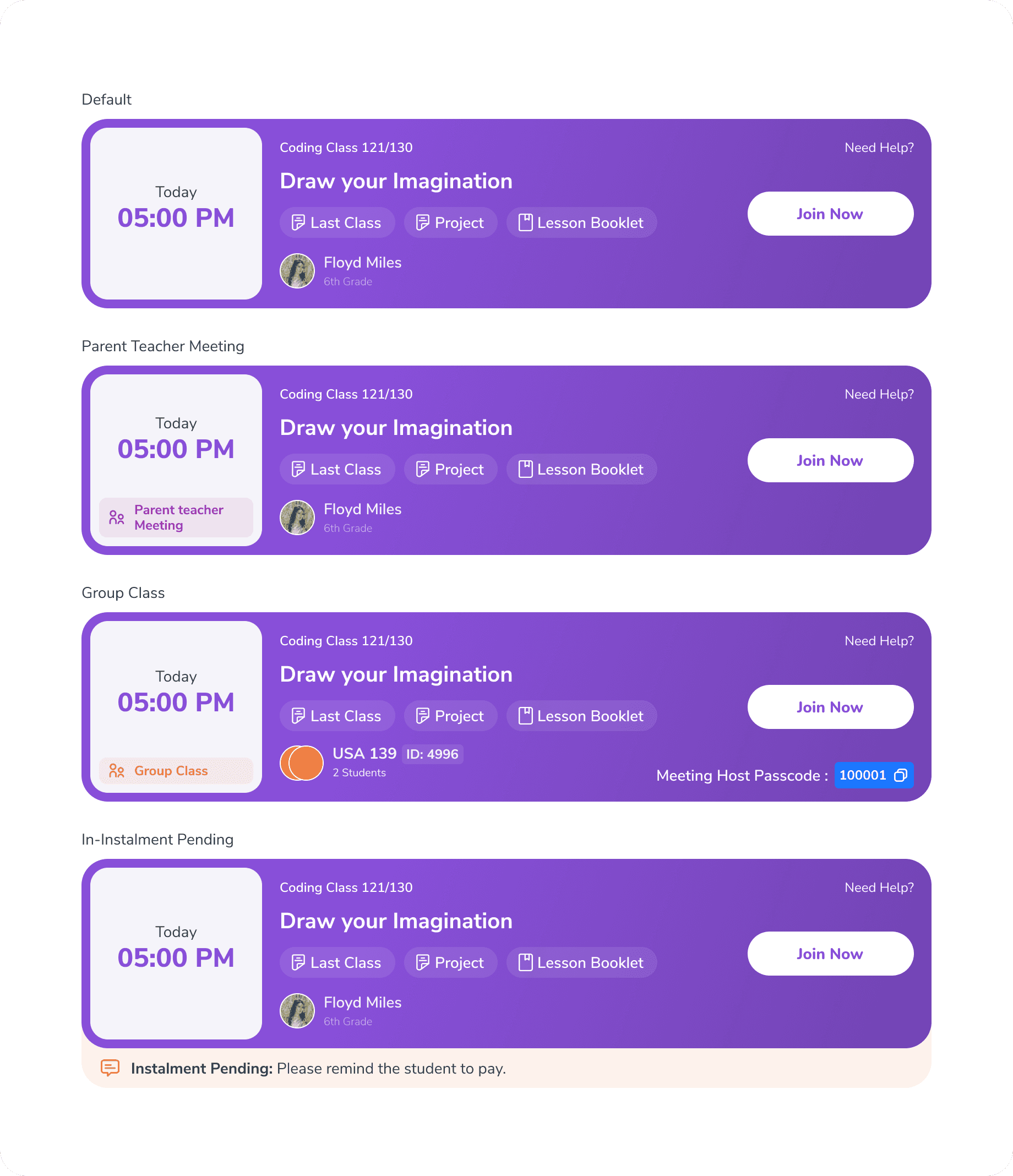
Primary Class Joining Card (New)
A prominent class joining card was placed at the top of the dashboard, clearly highlighting the next upcoming class.
Why
Teachers did not want to search for their next class—especially between back-to-back sessions. This change ensures the most time-sensitive action is always visible.
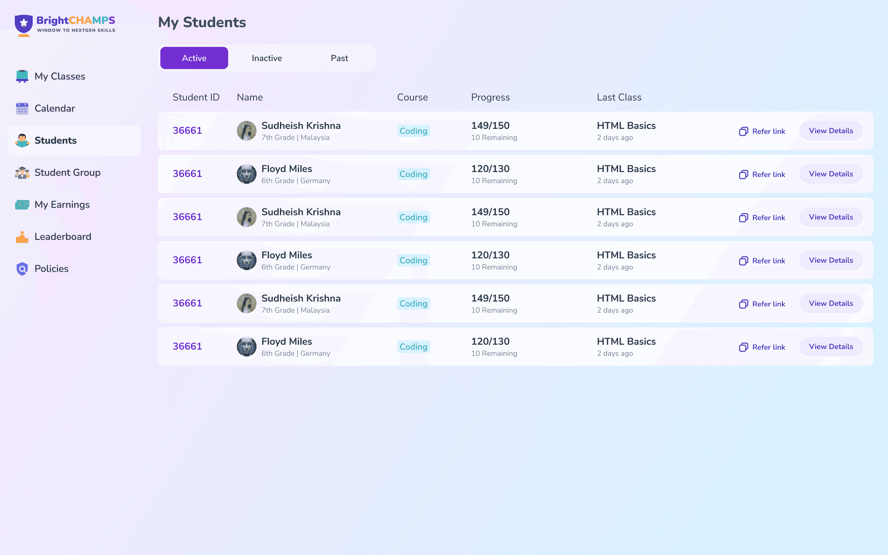
Student listing
he student listing page was simplified to improve scanability and faster access to student context.
Why
Teachers needed a quicker way to find and switch between students without scrolling or losing context.
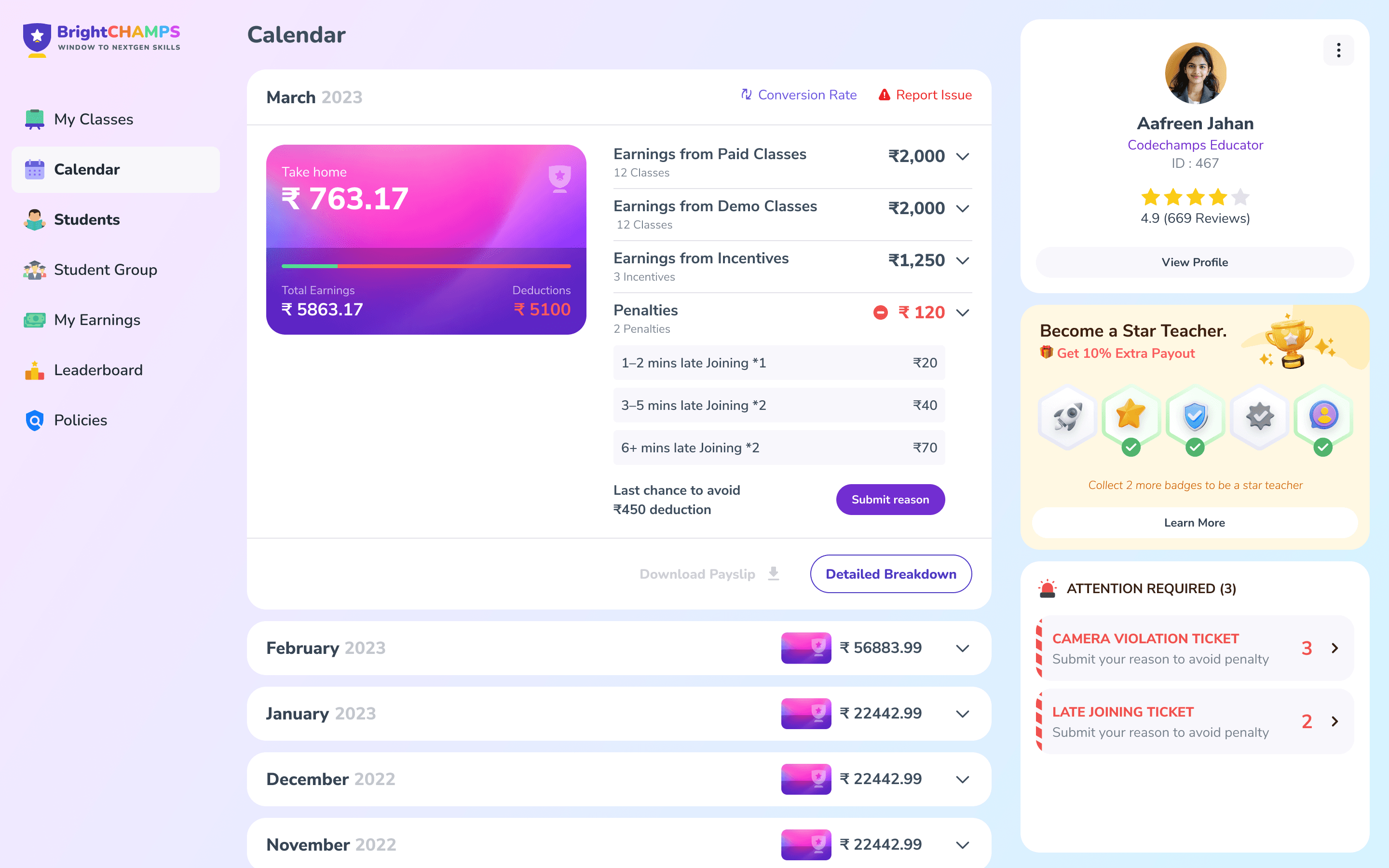
Earnings Page
The earnings page was refined to present payouts, deductions, and updates in a clearer and more consistent layout.
Why
Teachers found it difficult to understand earnings and deductions due to unclear structure and mismatched information, which led to confusion and mistrust.
New Features Introduced
Impact (Qualitative)
Reduced cognitive load by surfacing only the most critical information teachers need before and after classes
Improved class preparation by making last class context, materials, and next actions immediately accessible
Minimized navigation friction through clearer hierarchy, predictable navigation, and fewer context switches
Lowered visual and emotional fatigue by simplifying layouts and collapsing non-essential elements
Increased clarity and trust around feedback, deductions, and earnings through consistent presentation
Helped teachers prioritize work with a dedicated “attention required” view instead of mental tracking
Created a calmer, more supportive dashboard experience suited for daily, long-duration use
The redesign shifted the dashboard from being something teachers managed to something that actively supported their workflow.
Let’s have
a Chat
Copyright 2025 by Chembrath Sandeep